
Custom Tents for Brand Visibility: What Works (and What Gets Ignored)

Light grabs eyes long before words do at outside gatherings. When booths fill a fairground, fields host games, stages blast music, crowds wander markets, or teams hand out samples, every logo fights for notice. Blending into the noise? That just does not cut it when everyone shouts louder.
Custom tents matter most when they solve actual problems. Their worth shows up right there.
Not just about blocking sun or rain, a custom tent serves another role entirely. Standing out becomes easier when our company colors and logos show up on fabric overhead. That display sticks in minds longer than words alone ever could. Suddenly, a basic booth feels different, more deliberate, more seen. First moments matter most, and visuals shape them fast.
Still, some custom tents stand out less than others.
Most eyes land on certain tents right away, thanks to bold, focused branding. A few vanish in plain sight, even with giant signs or flashy tones. What shifts the balance tends to be small decisions in layout, color flow, or spacing. These details shape whether a name sticks or slips away.
Most people overlook some things completely, yet those same points actually matter a lot. A small shift in attention changes everything.
How Custom Tents Boost Brand Visibility at Outdoor Events and Trade Shows
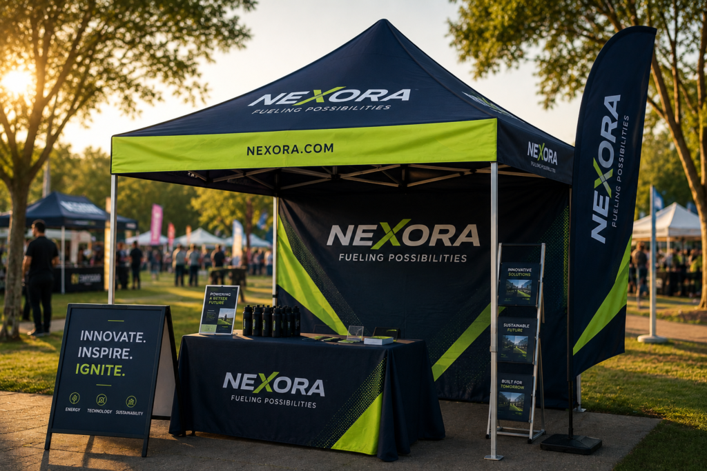
- Clear Logo Placement Matters
What we see begins when something stands out.
High up near the roofline works well for catching eyes from different directions. Think of the building’s peak; that spot grabs attention fast. Valances pull focus when folks walk by below. Side walls give us a chance to show our mark as people move around. Back walls matter just as much if someone turns that way. Size plays a big role; tiny ones fade into the background. Hang it too low, and heads or machines might cover it. Obstructions kill visibility every single time. Clear sight means a clear message.
Placed well, it sticks better in memory.
- Bold Colors Capture More Focus
Color shapes first impressions.
Every so often, bold shades catch eyes when crowds get thick. Instead of fading, our brand tones hold steady but punch up the contrast just enough to show clearly from far off.
Colors that work well pull the eyes first.
- Readability Often Ignored
Too much wording shows up on lots of brand messages.
Most folks passing by catch just a glance, maybe three seconds at most. Messy layouts? Tiny print? They make things hard to see right away. A quick thought beats long blocks of words every time. Instead of packing it full, space helps the eyes land where they should.
Simple messages create a stronger impact.
- Design Reflects Brand Identity
A well-designed shelter mirrors our company’s character. It acts much like a quiet ambassador, standing where values meet the open sky.
From fonts to color schemes, each detail shapes how people see our brand. Tents, signs, and printed handouts—they all speak louder when they match. Digital images feel more familiar when they echo what’s seen offline. Uniformity sticks in memory better than variety ever could.
Consistency builds trust.
- Visibility Works Over Distance
Before people come near, our branding must already be doing its job.
Standing too close might make us miss what drivers see down the street. Big images catch eyes first, yet sharp titles hold them longer. Space between elements gives clarity, even at speed.
What keeps some brands apart isn’t effort; it’s space. How far things have changed, with outcomes beyond expectations.
- Functionality Helps Branding
A single drawing on paper won’t fix everything. What matters comes after the sketch: action shapes results more than lines ever could.
Inside our tent, how things are placed matters more than looks. When entry spots confuse people, fewer stop by. Product layouts that block paths slow everything down. Light shapes how eyes move; wrong, brightness hides what’s for sale. Movement flows better when space breathes between items. This matters just as much as a food tent setup at festivals and outdoor markets, where foot traffic and flow are everything. Smooth walking beats flashy walls every time.
The function improves brand experience.
Final Thoughts
From far away, a tent with bold colors grabs attention fast. Logos stand out best when they are simple and placed where eyes go first. Messaging works well if it feels natural to read, not forced. Instead of clutter, space helps people take things in slowly. Branding sticks when every part looks like it belongs together. Even the shape of the structure can echo what our company stands for. Recognition grows quietly through repeated, clear visuals. Engagement follows when nothing feels off or confusing.
A well-made tent grabs attention without trying too hard. Because it stands out, people remember our brand long after they’ve walked by. When set up right, conversation flows more easily even in busy open spaces.
