The Psychology of Colors in UX/UI Design
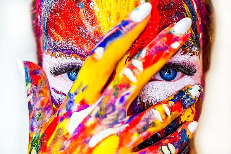
Our relationship with the colors that surround us is closely linked to the way we have perceived them throughout our lives. Certain colors transmit to us specific sensations because our brain automatically associates them thanks to our experiences with them.
If you are a graphic designer, or if you want to be part of a professional UX/UI design agency like Clay in San Francisco, then you must understand that the choice of color is a crucial factor in determining the success of a project.
The Psychology of Colors in Graphics
As you probably know, colors represent a sort of non-verbal language that manages to leverage the human mind and communicate very specific sensations, even before the eye codes the written word.
A green logo, for example, puts the observer in a specific emotional condition, which facilitates the transmission of an unconscious message before the word is actually read. This is because the human being associates green memories and emotions related to nature, meadows, woods, etc. Professional designers use colors to add extra value to the message.
The colors, therefore, manage to act at an intimate level of the mind and to direct a choice, often made almost automatically, precisely because of a biological component common to all mankind.
Each of the colors, depending on the context, user’s memories, or cultural background, generate certain emotions. Color psychology works based on the context in which we observe a color. Let us have a look at some colors that are often used in the design.
Also Read: WatchCartoonOnline
Red
Red is the color of life, the sun, fire. It causes opposite feelings – love and hate, joy and anger. It is eye-catching. It is also believed to stimulate blood circulation. Red is the color of the heart, lungs, and muscles; it makes a person talkative, excites, and enhances emotions – all revolutionary flags are certainly red. It makes the most lazy ones more active.
In design, this color usually transfers the romantic emotions; for example, think of Tinder’s user interface. This color can also be used to spark adrenaline and wake up the adventurous spirit. For instance, when you think of expensive race cars like Maseratti or Lamborghini, you usually imagine them in red.
Blue
The color blue brings a sense of peace, relaxation, and infinity. This color light affects the endocrine system, reduces stress, and relaxes the body. It is a pleasant color to look at which reminds us of the sea or of the sky. That is why many spa and beauty salons use blue in their interior. If you think of the major social networks like Facebook, Telegram or VK, they are also blue.
Yellow
Yellow symbolizes the midday sun and has a stimulating effect. To a greater extent, it is perceived by the left hemisphere of the brain, its “intellectual” half, and can have a positive impact on learning and the acquisition of professional skills. Yellow improves the mood of people who are always dissatisfied with something. Yellow is often associated with youth and childhood.
Green
Green is the color of nature. It has a calming effect, and a walk among the greenery is often healing. By implementing this color in the design, you can achieve the sensation of something youthful, up-to-date, friendly, and soothing. For instance, WhatsApp is the application the majority of people use to talk to family and friends, while Telegram is usually a working messenger.
Orange
Orange represents joy and happiness. It has a beneficial effect on a person who suffers from depression or is prone to excessive pessimism. People who wake up already tired and unhappy in the morning have a completely different mood, and should consider looking through the world with an orange glass.
Violet
Violet is associated with spirituality. It acts on the subconscious and helps a person to know themself, enhancing the effect of meditation. If you put on purple glasses and go to a crowded place, you can be sure that no one will even come near you. And if you want to moderate your appetite, put on purple glasses when you sit down at the table. Dishes in purple look very unappetizing.
Conclusion
The psychology of colors influences our choices, both in the preferences of an abstract color that we do or do not like as well as in connection to how the color is treated given the context.
To become a graphic designer you must constantly evaluate both factors and learn to choose when and how to use a certain color to transmit a clear message to the brain of the observer. The full understanding of the two factors, biological and environmental, at the basis of color psychology will allow you to hit a safe target every time you find yourself undecided about what choice to make.



Do you need more buyers for your website or online store? We can get you keyword targeted people precisely for your specific type of business